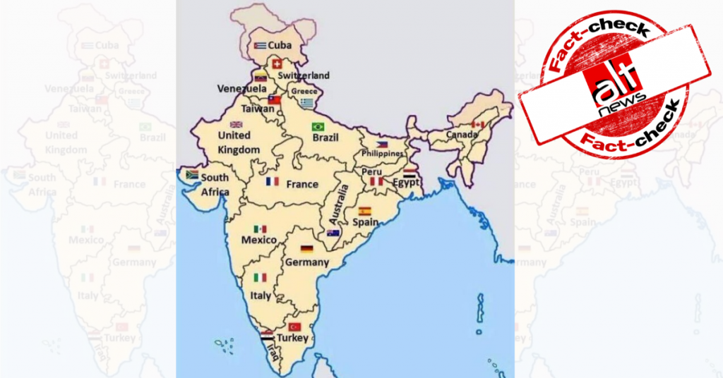
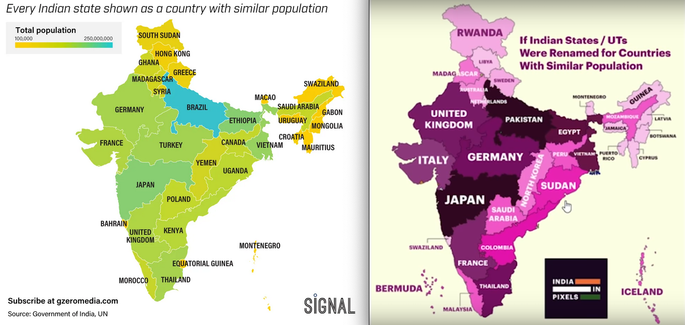
A map of India which compares Indian states with various countries on the basis of population has gone viral. Ram Madhav, national general secretary of Bharatiya Janata Party, was among those who tweeted the viral image. The text beneath the map says that it was redesigned by an “American CEO” who explained to his employees that “India is indirectly handling #covid19 situation of so many countries. it’s about managing the problem in an efficient manner”. This image was retweeted over 3,600 times (archive link). It is noteworthy that the map shows Pakistan Occupied Kashmir (PoK) and Arunachal Pradesh as disputed territory, which is a criminal offence under the Indian Penal Code (IPC).
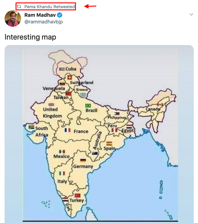
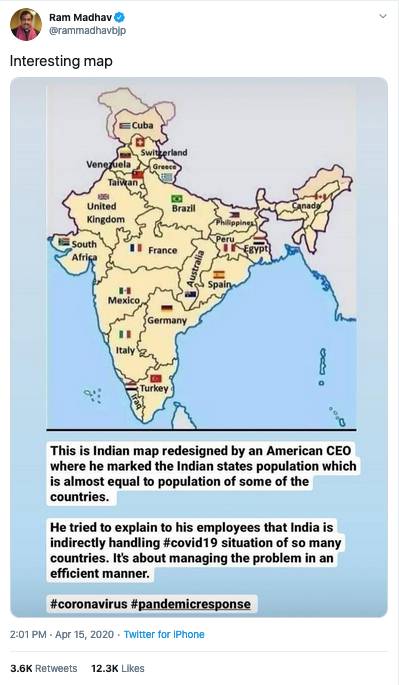 Chief Minister of Arunachal Pradesh Pema Khandu retweeted Madhav’s tweet.
Fact-check
Alt News performed a keyword search on Twitter and found that several verified users had posted an identical or similar map in the past. Some of those users include – Norwegian diplomat Erik Solheim, Indian sports journalist Mohandas Menon, president of Gzeromedia and Eurasia Group Ian Bremmer and Ziya Mera senior resident fellow at The Centre for Historical Analysis and Conflict Research.
The map was created by one Arpan Srivastava eight years ago. He alerted the same in a reply to SM Hoaxslayer on Twitter. If one notices carefully, the map shows Andra Pradesh and Telangana as one state. They were separated in 2014.
Thanks @SMHoaxSlayer. Actually, this image was created by me using MS paint, for a Quora answer 8 years ago : https://t.co/P0hOICcdZD. Back when I used to have too much time on my hand.
I am flattered that ppl think that American CEOs spend their time doing this kind of shit. 😂— Arpan Srivastava (@appysrivastava) April 15, 2020
Srivastava also attached a link to the map he had posted on Quora on November 26, 2012.
The map has been floating online since. It was shared by Amit Ranjan, co-founder of SlideShare, a US-based company. In 2016, Ranjan had tweeted the viral image and said, “Thought provoking map! –> “Indian states mapped to countries of equivalent population.” According to Ranjan’s LinkedIn, he currently works as an architect at DigiLocker, National eGovernance Division, Ministry of IT, Government of India.
Thought provoking map! –> “Indian states mapped to countries of equivalent population” #map #population pic.twitter.com/NDzMXA0Rj9
— Amit Ranjan (@amitranjan) April 13, 2016
Through another keyword search on Google, we found other varients of India’s map which compares the population of India states with countries across the world available on Gzeromedia and Vividmaps. The one on the left does not show PoK as a part of India. Facebook page Indian in Pixels has been credited for the map on the right. The page had shared the map in July 2019.
Alt News performed a reverse image search of the image posted by Ranjan on Yandex and noticed that several Facebook and Twitter users have posted the map in the past along with Hindi text that also claims that it has been designed by an NRI/ CEO at an American company. However, unlike Madhav’s post, this text points out how the Prime Minister is managing a country where different states have a population equal to countries across the globe. In 2017, BJP member Anant Gandhi (as per Facebook and Twitter) posted the viral map on Facebook along with the same Hindi text. (archive link)
The map becomes a part of a TV9 Bharatvasrh broadcast
Meanwhile, it seems like editors at TV9 Bharatvarsh were really impressed by an “infographic” which is eight years old. On April 14, the Hindi news channel aired a bulletin which showed an identical data from the viral map. The video is available on YouTube as well. The report only compared the populations of the various countries with Indian states to illustrate the challenge at hand for the Indian government and how ‘well’ they have responded. TV9 Bharatvarsh only concentrated on the population of Indian states which is equal to countries across the globe. The channel praised PM Modi without comparing other important data points such as compensation for the unemployed or tests per million conducted in those other nations.
Therefore, an 8-year-old map which merely compares the population of Indian states with countries around the world has been used to praise PM Modi for tackling coronavirus in such a highly populated country. However, other factors such as the number of tests conducted, relief measures or unemployment benefits have not been considered.
Update: Arpan Srivastava’s post and the fact that the map shows Andhra and Telangana as one state have been added to the fact-check.